Compass Blue Paint Color: An In-Depth Exploration


Intro
Compass Blue is not just a color; it is an expression of elegance and sophistication. This shade, radiating a sense of tranquility and depth, has found its place across various design aspects. Understanding its attributes can significantly enhance the ambiance of any space. We will delve into the origins of Compass Blue, its psychological effects, applications, and effective pairing methods with other colors.
Outdoor Decor Ideas
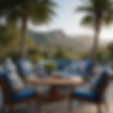
Incorporating Compass Blue into outdoor spaces can transform them into serene retreats. This color works beautifully with natural elements, creating a harmonious environment. Here are several ways to utilize Compass Blue in outdoor decor:
Seasonal Inspirations
During spring and summer, Compass Blue pairs wonderfully with lighter, airy hues. Think of linen cushions or light bamboo furniture against this backdrop. In autumn or winter, deeper shades complement the robust essence of Compass Blue, adding warmth to the cool exterior. This versatility is significant for maintaining an inviting atmosphere year-round.
Furniture Selection
Choosing furniture that aligns with Compass Blue can enhance outdoor spaces. Consider items made from natural materials like wood or wicker, which harmonize well with this color. The use of plush seating in this shade invites relaxation. For a more structured look, metal furniture in chrome or wrought iron can create a striking contrast.
Decorative Lighting
Lighting is crucial in accentuating outdoor decor. Warm-toned lights can balance the cool undertones of Compass Blue, inviting warmth in evening settings. String lights wrapped around trees or lanterns on tables can create an enchanting atmosphere for gatherings.
Plant Arrangements
Integrating greenery can enliven Compass Blue decor, providing a vibrant contrast. Plants with bright blossoms or lush foliage can effectively complement this shade. Herbs in pots or scented flowers are excellent choices for adding depth and aroma.
Hardscaping Solutions
Consider using Compass Blue in hardscape elements like patio stones or planters. This can create a cohesive look that transports the eye throughout the space. Including a water feature, perhaps painted in a similar shade, can enhance the overall tranquility of your outdoor environment.
Sustainable Practices
Incorporating sustainable practices when utilizing Compass Blue for outdoor decor can enrich the aesthetic while being environmentally conscious. Opt for eco-friendly paints and materials, ensuring a low impact on nature. Choose native plants that thrive in local climates, requiring less maintenance and water.
"Color is the keyboard, the eyes are the harmonies, the soul is the piano with many strings." - Wassily Kandinsky.
Outdoor Entertaining
The elegant nature of Compass Blue makes it an ideal choice for outdoor entertaining. It sets the stage for sophisticated gatherings and celebrations. Here are some ideas for creating memorable experiences outdoors:
Hosting Luxurious Gatherings
When hosting luxurious gatherings, ensure that the seating arrangements complement Compass Blue. Incorporate lavish fabrics and decorative pillows in complementary colors.
Party Planning Tips
Plan themed parties around Compass Blue, perhaps a nautical theme. Utilize tableware that reflects this shade, which creates a cohesive look. Mix and match with white or silver to enhance the elegance.
Al Fresco Dining Trends
Create inviting dining experiences with Compass Blue accents in table settings. Use this color in table runners or centerpieces to maintain a cohesive theme throughout your dining space. Consider adding candles for a romantic ambiance as the sun sets.
Exclusive Destinations
Using Compass Blue as part of your decor can inspire travel to destinations that mirror its peaceful essence. Consider luxurious resorts or private villas that allow for personalized experiences.
Hidden Gems
Seek hidden gems that incorporate Compass Blue in their architecture or surroundings. Coastal destinations often utilize this paint color to create refreshing atmospheres conducive to relaxation.
Luxury Resorts
Opt for luxury resorts that feature Compass Blue palettes in their design. These resorts typically provide serene settings for dining, lounging, or simply unwinding.
Private Villas
Consider renting private villas that embrace Compass Blue. They often offer secluded experiences where one can indulge in the surroundings without disturbance.


Home and Interiors
When applying Compass Blue within home interiors, it is essential to marry comfort with style. This shade offers countless opportunities for both creativity and luxury.
Interior Design Trends
Compass Blue can highlight various interior design trends. Minimalism, for instance, can effectively incorporate this color through accents, allowing the hue to stand out against neutral tones.
Home Organization
Use storage solutions in Compass Blue, ensuring they are both practical and visually pleasing. Containers or shelves in this shade can add elegance to any room.
Smart Home Innovations
Integrate smart home innovations that complement Compass Blue. Color-changing lighting systems can give you the flexibility to transition between shades as needed.
In summary, Compass Blue signifies more than just a choice in color; it embodies elegance and sophistication that can enrich any space. Understanding its applications and effects can significantly enhance design choices, especially for discerning individuals seeking to elevate their surroundings.
Prolusion to Compass Blue Paint Color
Compass Blue is more than jus another hue in the color spectrum. It carries a significance that resonates deeply in various design contexts. Understanding its essence can help create atmospheres of tranquility, sophistication, and style. This section aims to illuminate the defining elements and historical importance of Compass Blue, serving as a vital foundation for later discussions on its applications and effects in different spaces.
Definition and Characteristics
Compass Blue is primarily characterized by its calm and grounding essence. This shade presents a versatile appeal, suitable for diverse settings ranging from the modern to the traditional aesthetic. It can be described as a deep blue with subtle gray undertones, which enables it to complement a variety of color palettes in both interior and exterior design. When applied correctly, it can make spaces feel expansive and serene while simultaneously evoking a sense of refinement.
The specific values of Compass Blue can vary across brands but generally falls within a certain range on the color wheel. This consistency is pivotal for designers to maintain coherence within their projects. The color can also exhibit a different mood based on applied lighting—warm natural light may enhance its inviting qualities, while cooler artificial lighting could emphasize its depth and sophistication.
Historical Significance
The historical significance of Compass Blue is rich and multifaceted. This hue has roots in maritime culture, often associated with navigation and exploration. Historically, deep blues were used extensively in nautical contexts, reflecting the vastness of the ocean. Such uses have imbued this color with meanings of guidance and stability, making it a favored choice among designers aiming to instill a sense of balance within their work.
Throughout the decades, Compass Blue has appeared in various notable design movements. From the Arts and Crafts movement that emphasized craftsmanship to the contemporary minimalist designs, this color has retained its prominence. Its ability to adapt while resonating with history is a testament to its enduring appeal.
"Colors have a profound impact on our emotions and perceptions; Compass Blue articulates a legacy of elegance and calmness that still holds relevance today."
The Palette of Compass Blue
The palette surrounding Compass Blue is vital in understanding how this color integrates into various design contexts. Its nuances impact interior and exterior aesthetics that appeal to a discerning audience. Whether utilized in lavish settings or subtle backgrounds, it shapes the visual tone of a space.
Different Shades of Compass Blue
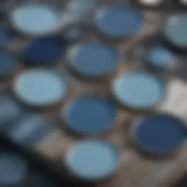
Compass Blue encapsulates a collection of shades that evoke distinct atmospheres. Ranging from deep navy to lighter cerulean, each variation serves a different purpose and creates unique feelings. The richness of a dark shade can inspire comfort and elegance in living areas, while a lighter hue might reflect openness and tranquility, perfect for spaces demanding a fresh feel.
Some notable shades of Compass Blue include:
- Deep Compass Blue: This shade is often used in upscale dining environments, providing a dramatic backdrop for fine dining experiences.
- Sky Compass Blue: A lighter variation that can brighten up bedrooms and meditation areas, encouraging relaxation.
- Muted Compass Blue: Ideal for spaces that wish to incorporate a sophisticated yet subtle touch.
Using these shades effectively requires understanding their interplay with natural light and surrounding colors. Designers should consider how light at different times can alter the appearance of these shades, ensuring the overall balance in color scheme.
Finish Variations
The finish of Compass Blue paint can greatly change its perception and suitability for particular applications. There are several options when it comes to finishes, including:
- Matte: This finish avoids glare by absorbing light, suitable for low-traffic areas like bedrooms.
- Satin: Providing a slight sheen, satin finishes are more durable and easier to clean, making them a good choice for kitchens and dining spaces.
- Glossy: The most reflective option, glossy finishes are often used in high-end commercial settings, lending a modern and sophisticated touch.
When selecting a finish, consider not only the functional requirements of a space but also the desired visual effect. A gloss finish on Deep Compass Blue can add drama, whereas a matte application allows for a more understated elegance.
"The choice of finish can elevate the impact of Compass Blue from simple to spectacular, transforming spaces into luxury statements."
Psychological Impact of Blue
The color blue holds significant weight in the sphere of design and psychology. The Psychological Impact of Blue is vital when discussing Compass Blue paint color. Understanding its emotional and cultural associations allows designers and homeowners to harness its potential effectively. Blue can evoke feelings of calmness and tranquility. By fostering a serene environment, it has the ability to enhance mood and well-being. This characteristic makes it a popular choice in various settings, from luxury residential spaces to high-end commercial environments.
Emotional Resonance
When one thinks of the color blue, particular emotions often surface. Compass Blue, with its distinct hue, particularly evokes feelings of peace and clarity. This emotional resonance can lead to significantly enhanced experiences in living and working spaces. Studies show that blue tones can lower heart rates and create a sense of safety. In interior design, using Compass Blue can establish a serene backdrop, perfect for relaxation in bedrooms and rejuvenation in living areas.


Moreover, the tranquility of Compass Blue can encourage creativity. Thus, it’s suitable for office spaces or creative studios, where clarity of thought is paramount. By choosing this color, designers can create a harmonious environment that promotes productivity alongside relaxation.
Cultural Associations
Cultural perceptions play a crucial role in how we interpret colors. Blue is often linked with various significant meanings across different societies. For instance, in many Western cultures, blue symbolizes trust and loyalty. This makes it a preferred choice for brands that aim to convey reliability.
In other contexts, such as Eastern cultures, blue is associated with healing and tranquility. It is revered in art and architecture, often used to signify wisdom and protection. When applying Compass Blue in design, it is crucial to consider these cultural significances. The color can serve a dual purpose, acting as both aesthetic appeal and meaningful conversation starter.
Utilizing Compass Blue in Interior Design
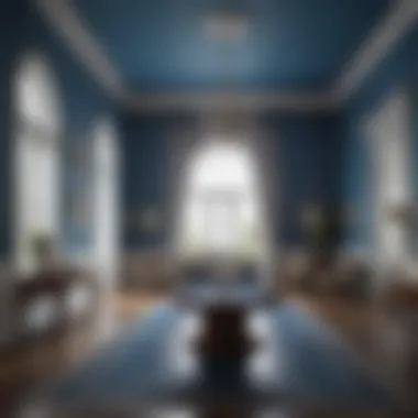
Utilizing Compass Blue in interior design creates a distinctive atmosphere that embodies sophistication and tranquility. This color serves not only as a visual element but also plays an important role in influencing the mood of various spaces. When applied thoughtfully, Compass Blue can enhance the aesthetic appeal of both modern and traditional interiors. It adds depth and character, making any space feel more inviting.
Living Spaces
In living spaces, Compass Blue can transform an area into a calm, serene environment. The application of this color on walls, furniture, or decorative accents can set a tone of relaxation and elegance. Its versatility allows it to work beautifully in both bright and dimly lit spaces. Pairing Compass Blue with neutral tones, such as whites and greys, can create a balanced and contemporary look. Additionally, the use of textured fabrics in this color can add dimension and luxe feel.
- Incorporating Compass Blue: Consider using Compass Blue on a feature wall, which acts as a focal point in the room.
- Accent pieces: Curtains, throw pillows, or area rugs in Compass Blue can introduce subtlety without overwhelming the design.
By thoughtfully integrating this color, you can achieve a stylish and cohesive look in your living areas.
Bedrooms and Relaxation Areas
Bedrooms are personal retreats, and the choice of color significantly impacts the sense of calm and relaxation they provide. Compass Blue is particularly ideal for these spaces as it evokes feelings of peace and tranquility. A soft application of this color can create an inviting atmosphere, making it conducive to restful sleep and relaxation.
- Wall Treatment: A lighter shade of Compass Blue can work wonders on walls, providing a gentle backdrop that complements various styles of bedding.
- Accent Decor: Using darker hues in pillows or throws can create contrast while maintaining harmony in the overall scheme.
“By utilizing Compass Blue, bedrooms transcend mere functionality, becoming havens of comfort and style.”
Kitchens and Dining Spaces
In kitchens and dining areas, Compass Blue can inject personality while maintaining a refreshing ambiance. This color is a fantastic choice for cabinetry or back walls, offering a modern twist to traditional designs. Its cooling tone can balance the warmth commonly associated with food preparation and dining areas.
- Cabinetry: Consider applying Compass Blue on kitchen cabinets for a bold statement while keeping the mood light.
- Dining Accents: Incorporating Compass Blue in table settings or artwork can complement the culinary experience, making it visually appealing.
Using Compass Blue in these spaces can create a harmonious flow, making gatherings and meal times more enjoyable.
Overall, the application of Compass Blue in interior design not only enhances the visual appeal but also curates a methodical ambiance that aligns with the goals of elite design. Its use in living spaces, bedrooms, and kitchens illustrates its versatility and sophistication, making it an invaluable addition to any high-end interior.
Exterior Applications of Compass Blue
Exploring the exterior applications of Compass Blue paint color reveals its profound impact on both aesthetic appeal and property value. This vibrant yet tranquil hue translates well to various outdoor settings, enhancing the overall character of buildings and outdoor spaces. When considering the vitality and ambiance that different colors can achieve, Compass Blue emerges as an effective choice for creating a cohesive outdoor theme.
Facade and Architectural Features
Applying Compass Blue on facades can radically transform the visual perception of a structure. This color provides a striking contrast against natural elements, while simultaneously invoking a sense of calmness. Here are some key points about its application on facades:
- Aesthetic Appeal: Compass Blue is versatile, blending well with both modern and traditional architectural styles. It adds an inviting touch that captures attention without overwhelming the senses.
- Enhanced Property Value: Utilizing this color effectively can increase a property’s market appeal. A well-painted facade may resonate more with potential buyers, indicating quality and careful maintenance.
- Durability: Choosing high-quality paint with Compass Blue can withstand outdoor elements. It resists fading under sunlight, ensuring longevity in its appeal.
Incorporating Compass Blue into architectural features like trims, doorways, and window frames can further elevate the look. When paired with bright whites or natural wood accents, it magnifies the charm of the structure.
Garden and Patio Decor
The application of Compass Blue extends well beyond the architecture of a building; it can greatly enhance outdoor living spaces. In garden and patio settings, this color introduces a fresh and airy feel that uplifts the environment. Consider these aspects:
- Furniture and Accessories: Use Compass Blue in outdoor furniture, cushions, and decorative pieces. It complements the greenery of plants, creating a harmonious garden space.
- Planters and Pots: Planters painted in Compass Blue can provide a striking contrast against the flora, drawing the eye and creating focal points.
- Outdoor Lighting: Lighting fixtures in Compass Blue can subtly blend into the space while reflecting light beautifully at night, creating a serene ambiance.
By integrating Compass Blue into garden and patio decor, you not only create stylish areas for relaxation but also encourage a space that invites tranquility and social interaction.
Using Compass Blue in exterior applications allows for a distinct style that enhances both the residence and its surroundings, providing a sophisticated aesthetic without sacrificing comfort.
Color Pairing Strategies
Exploring the color pairing strategies for Compass Blue is essential in understanding how to enhance its charm in any space. The interplay of colors can significantly influence the overall aesthetic and atmosphere, allowing designers and homeowners to achieve desired moods. By understanding complementary and contrasting tones, individuals can create visually appealing and sophisticated environments that invite tranquility and elegance.
Complementary Colors
Using complementary colors alongside Compass Blue allows for a cohesive and balanced design. Complementary colors are those that sit opposite each other on the color wheel. For Compass Blue, this commonly includes warmer tones such as rich oranges or soft corals. The warm hues serve to highlight the coolness of Compass Blue, creating a vibrant contrast that can enliven a space.


- Murphy's Coral – This peachy hue pairs well with Compass Blue, bringing warmth without overwhelming it.
- Golden Yellow – A lively yellow can elevate the energy when used in accents or furnishings against Compass Blue walls.
- Terra Cotta – This earth tone can add depth to the overall color palette, fostering a warm and inviting atmosphere.
It is important to apply these complementary colors in moderation to prevent overwhelming the serene nature of Compass Blue. Accent pieces such as cushions, artworks, or furniture can showcase these colors while maintaining the primary focus on blue.
Contrasting Tones
Contrasting tones introduce bold elements in a space dominated by Compass Blue. While complementary colors create harmony, contrasting tones provide an opportunity for drama and sophistication. Examples of effective contrasting tones include deep grays, charcoal, and even understated blacks.
"Contrasting tones can evoke elegance and intrigue, with Compass Blue serving as a captivating backdrop."
Here are some options:
- Charcoal Gray – This rich color enhances the depth of Compass Blue while maintaining an understated elegance.
- Deep Emerald Green – A touch of green can invigorate the palette, creating visual interest without clashing.
- Soft White – Using white provides a crisp contrast that illuminates spaces, emphasizing the blue's unique character.
When utilizing contrasting colors, the objective is to create focal points within the space. This could be in the form of an accent wall, decorative elements, or significant furniture pieces. The juxtaposition will help to amplify the visual appeal of Compass Blue while highlighting its distinct beauty.
Compass Blue in Luxury Spaces
Compass Blue stands out in the realm of luxury design. Its deep and rich hue adds an air of sophistication while serving functional purposes in different spaces. The significance of Compass Blue in luxury environments is multi-faceted. It not only enhances aesthetic appeal but also influences mood and perception.
The color brings a sense of tranquility and calm to environments designed for relaxation or stimulation. Appropriate use of Compass Blue can elevate any space, both residential and commercial, making it a favored choice among discerning designers.
High-End Commercial Applications
In commercial spaces, Compass Blue offers a striking visual identity that can reflect a brand's values and ethos. Many high-end restaurants and boutique hotels employ this color to create a luxurious backdrop. It is often used in entryways, accent walls, and even detailed features like upholstery.
Key Benefits of Compass Blue in Commercial Spaces:
- Brand Reinforcement: When utilized correctly, it creates a lasting impression on clients and customers.
- Atmosphere Creation: It can transform an ordinary space into an extraordinary experience.
- Versatility: Works beautifully in diverse applications, be it a fine dining establishment or a boutique store.
In many cases, Compass Blue is used in combination with metallic accents, such as gold or brass.
This pairing not only complements its richness but also introduces an element of glamour.
Residential Luxury Design
In residential settings, Compass Blue can redefine a home's elegance. Living rooms, bedrooms, and even home offices can benefit from its calming properties. Designers encourage its use in private quarters for a serene and restful ambiance.
Considerations for Using Compass Blue in Homes:
- Lighting Effects: Natural and artificial light can alter the perception of the color. Testing samples in situ is essential.
- Complementary Furnishings: Selecting furniture and decorative accessories that harmonize with Compass Blue will enhance its effect. Neutral shades, like whites and grays, work effectively here.
- Durability: Since it's often used in luxurious applications, ensuring that the chosen paint has excellent durability and stain resistance is critical.
Choosing Compass Blue is not merely about aesthetic preference; it reflects a commitment to quality and a curated lifestyle.
Practical Considerations
Understanding the practical considerations when using Compass Blue paint is essential for achieving the desired aesthetic and functionality. This section addresses key elements such as durability, maintenance, and proper application techniques. Each factor plays a significant role in ensuring that the color not only looks appealing but also withstands the test of time in both residential and commercial environments.
Durability and Maintenance
When selecting Compass Blue for your space, consider its durability. Paints are not just aesthetic choices; they need to endure daily wear and tear. Compass Blue is often available in formulations designed to resist fading, chipping, and peeling. High-quality paints, such as Benjamin Moore and Sherwin-Williams, ensure that your chosen hue maintains its vibrancy over the years.
Regular maintenance is also crucial. This includes cleaning and touch-ups. Choose a finish that suits your specific need. For areas with high traffic, consider a semi-gloss or satin finish. These options not only enhance durability but also facilitate easier cleaning.
Key Points on Durability and Maintenance:
- Choose Quality Brands: Prioritize reputable manufacturers for longer-lasting results.
- Regular Touch-ups: Keep a small supply of leftover paint for maintenance.
- Cleaning: Use gentle cleaning agents for longevity.
The End
Compass Blue as a paint color serves as a synthesis of aesthetic appeal and practical application. Its versatility makes it a compelling choice for various settings, both interior and exterior. As explored throughout the article, understanding its unique characteristics and psychological impact allows designers and homeowners alike to apply it effectively.
The conclusions drawn here emphasize how Compass Blue can evoke feelings of calm and sophistication. By saving room for interpretation, it invites creativity in design while maintaining elegance.
Final Thoughts on Compass Blue
Incorporating Compass Blue into any space can elevate its ambiance.
- The depth of the color provides a backdrop that enhances other design elements.
- Its range, from deep to lighter shades, offers flexibility depending on the desired mood and style.
- Practical aspects, including its durability and maintenance, ensure it remains a wise choice over time.
It's essential to consider the context in which Compass Blue is used. Whether in luxury residential settings or high-end commercial applications, its presence asserts sophistication.
Ultimately, Compass Blue not only contributes to visual appeal but also plays a vital role in creating spaces that resonate on a deeper emotional level. The careful combination of this color with the right finishes and materials will redefine any area into a sanctuary of style.


